

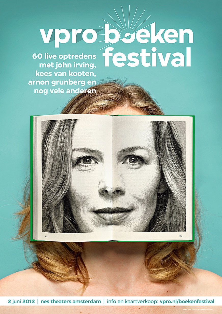


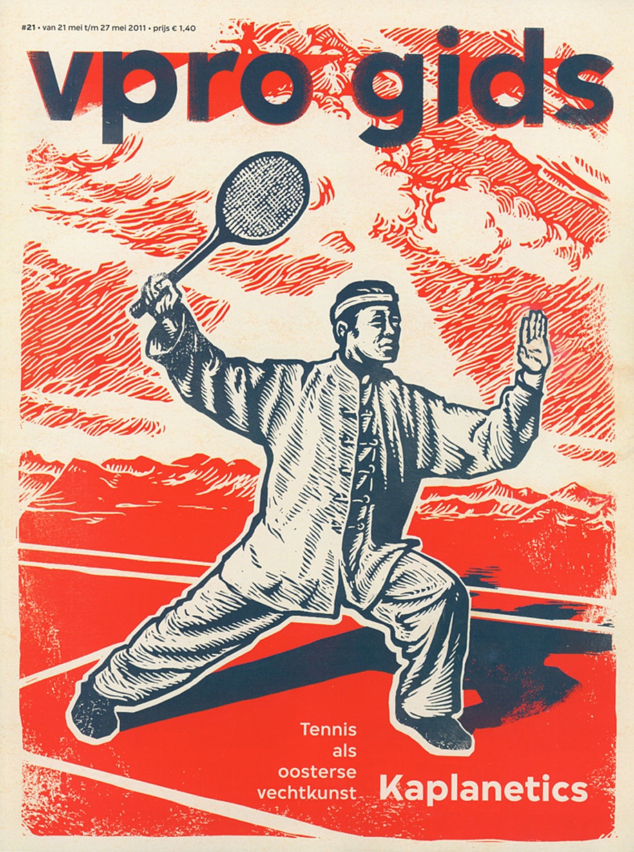
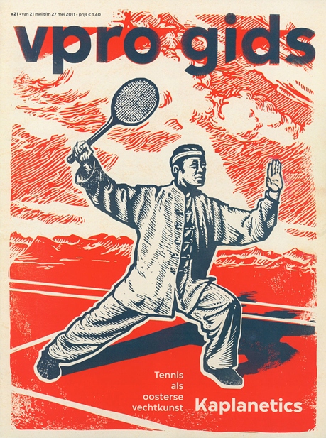


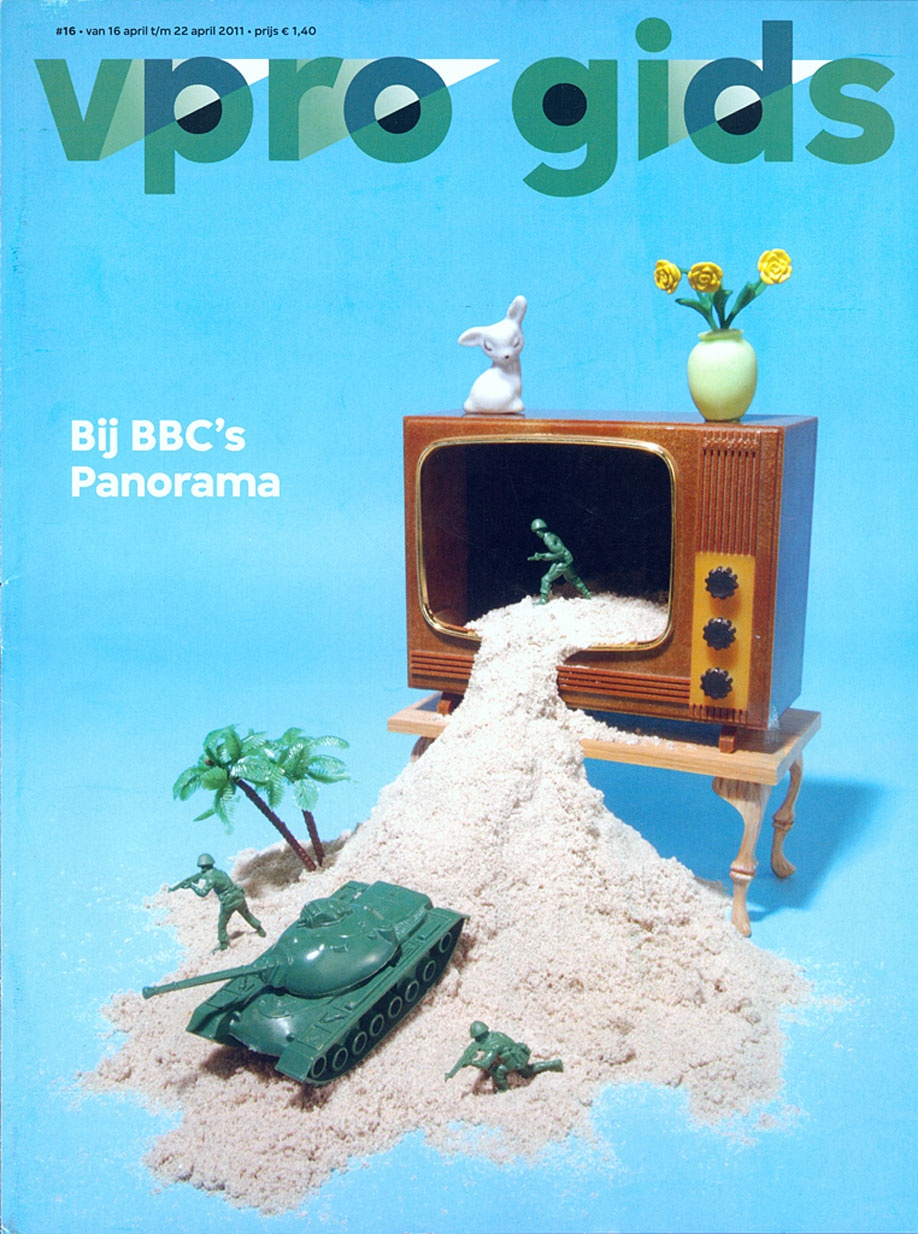


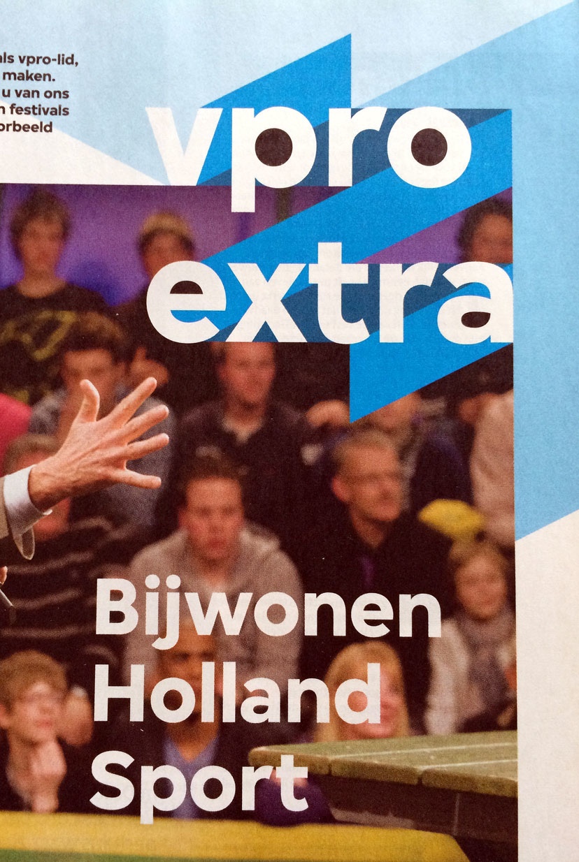


In August 2010, Dutch public broadcasting corporation VPRO launched their new identity, designed by studio Thonik in Amsterdam. Based on the four letters of the VPRO logo, Bold Monday developed a custom type family to complement the new visual identity.
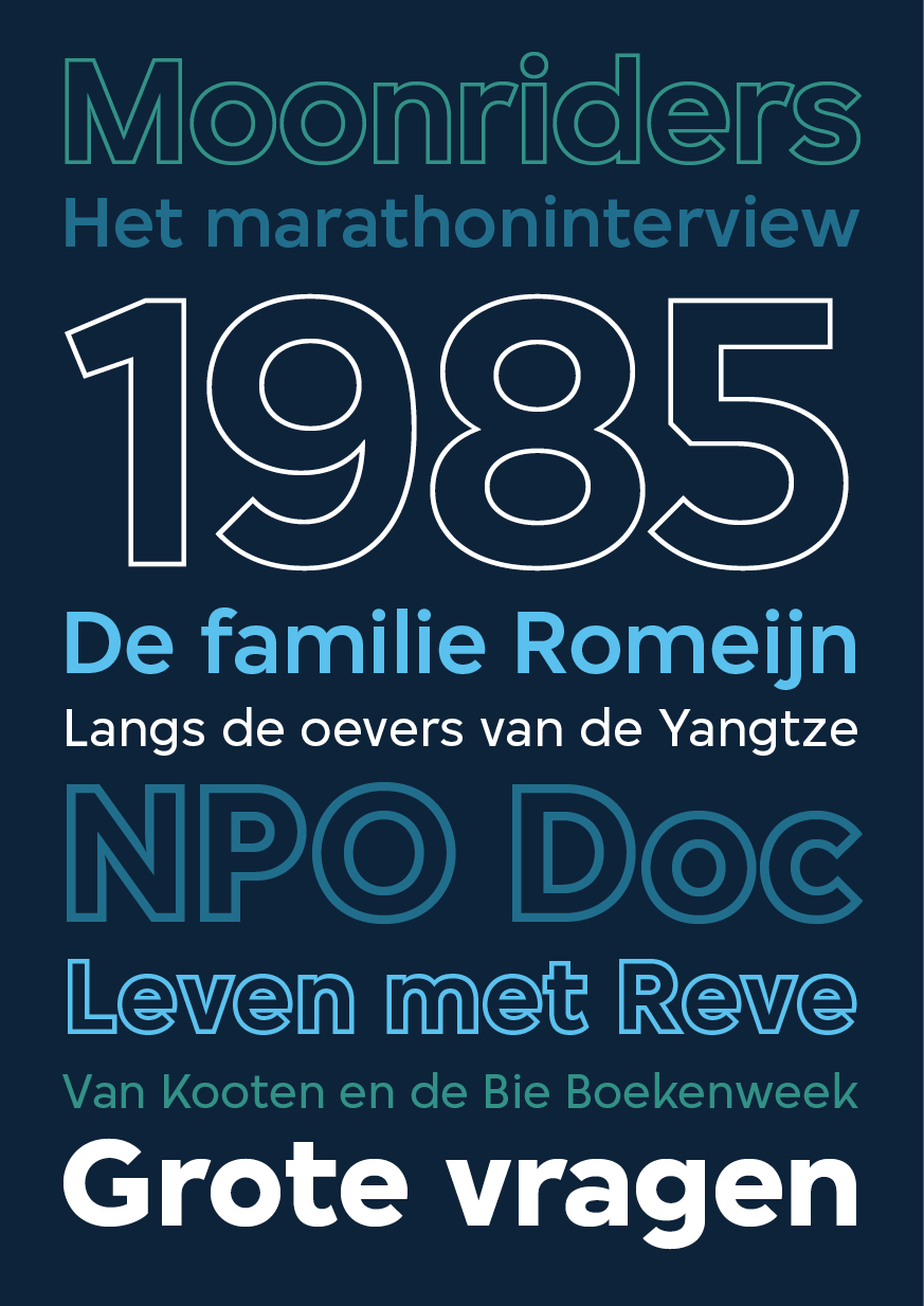
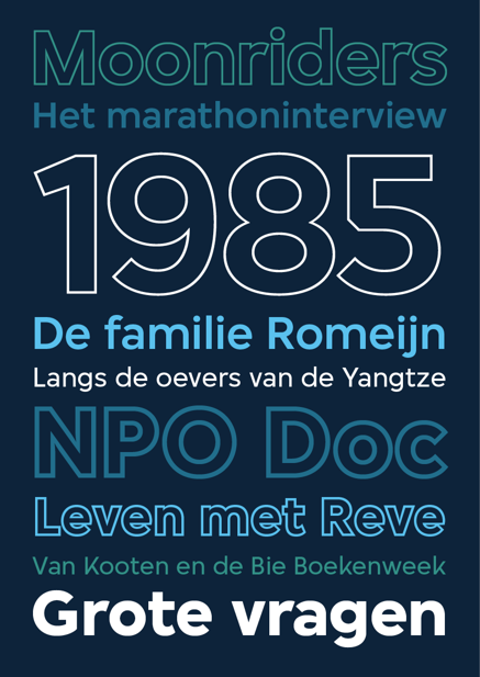
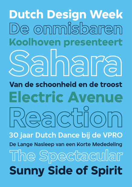
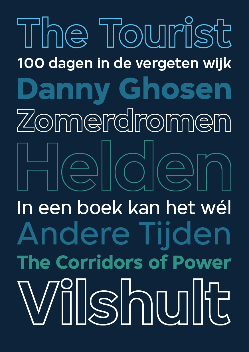
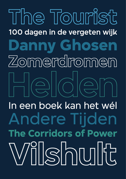
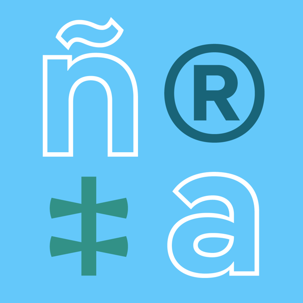
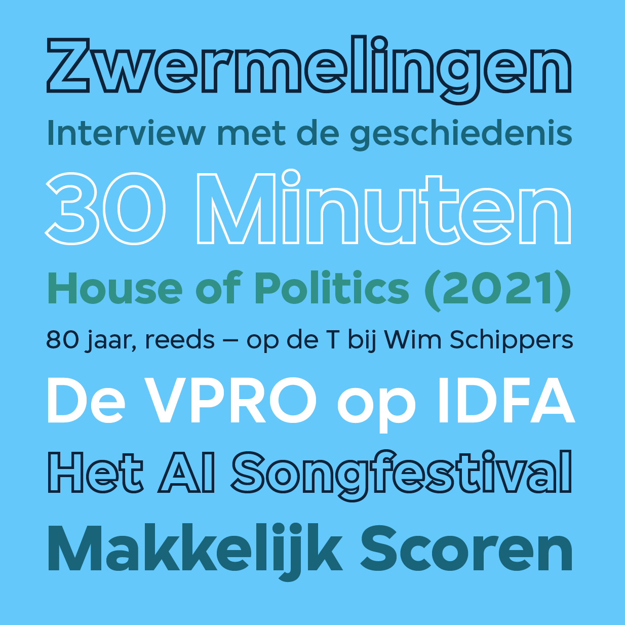
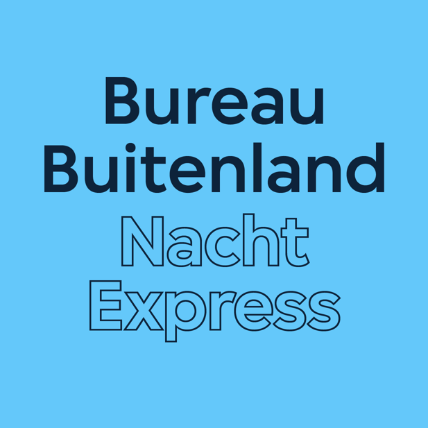
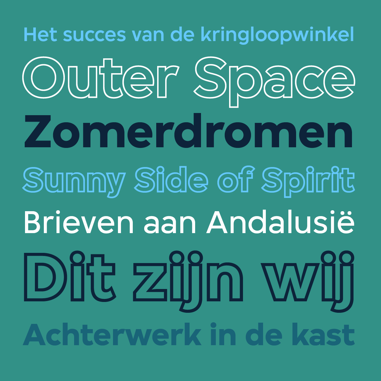
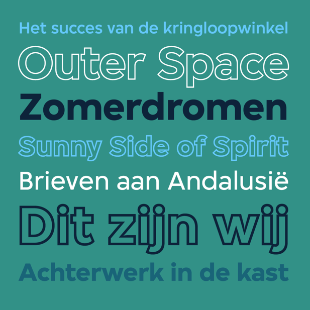
The typeface belongs to the genre of geometric sans-serifs, a group in which Futura (1927) and Avant Garde (1970) can be regarded as the most prominent members. Compared to those two typefaces, the VPRO family is less rigid — the ‘o’ is not a perfect circle for instance — and has a warmer, more humane appearance. The three weights include many stylistic alternates and special ligatures such as the Dutch ‘ij’ and ‘IJ’-digraph.
Matching outline versions were added in 2019 and 2025. For a broad language support, the typeface was expanded to include a Latin Extended character set in 2025.
With a generous x-height and its playful details, the typeface is designed to feel most at home in larger sizes and display applications.
2010–2025
Client
VPRO, Hilversum
Art direction
Thonik, Amsterdam