


Nationale Nederlanden, or NN for short, is one of the largest insurance companies in The Netherlands. In 2021, renowned design studio Total Design, approached Bold Monday for a corporate type refresh. NN had previously used a retail sans-serif and Calibri for correspondence but now preferred a custom design for more flexible usage.
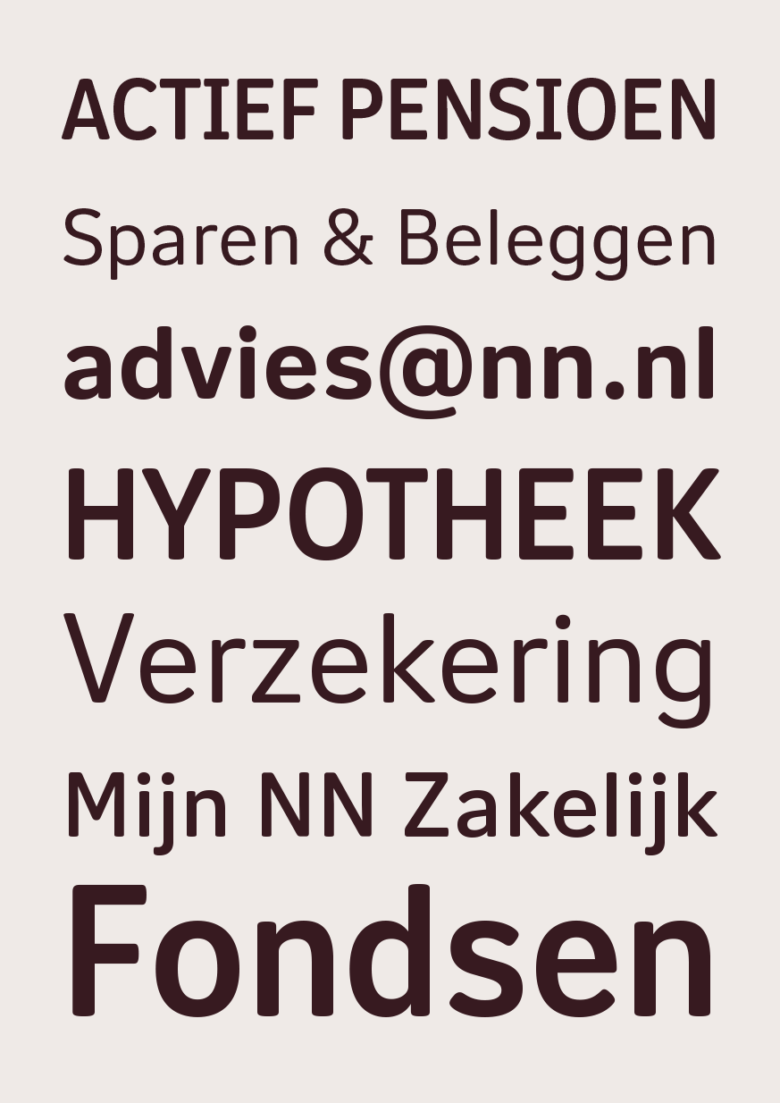
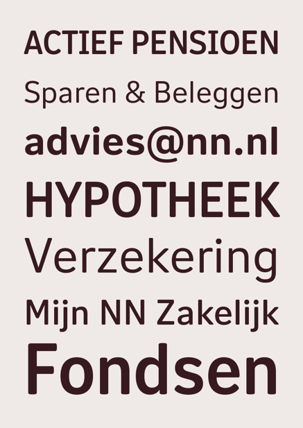
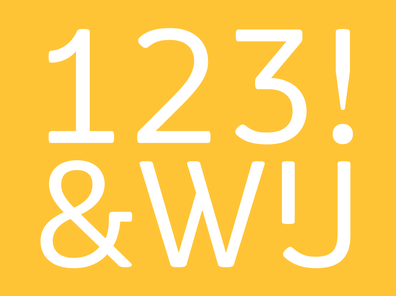
The new bespoke typeface is based on Nitti Grotesk as a springboard but with extensively modified proportions, shapes, and terminals to cater to all of NN’s use cases and requirements. At the request of a branding manager at NN, who prefers not to use italics, only upright roman styles were created along with a more condensed version for headlines.
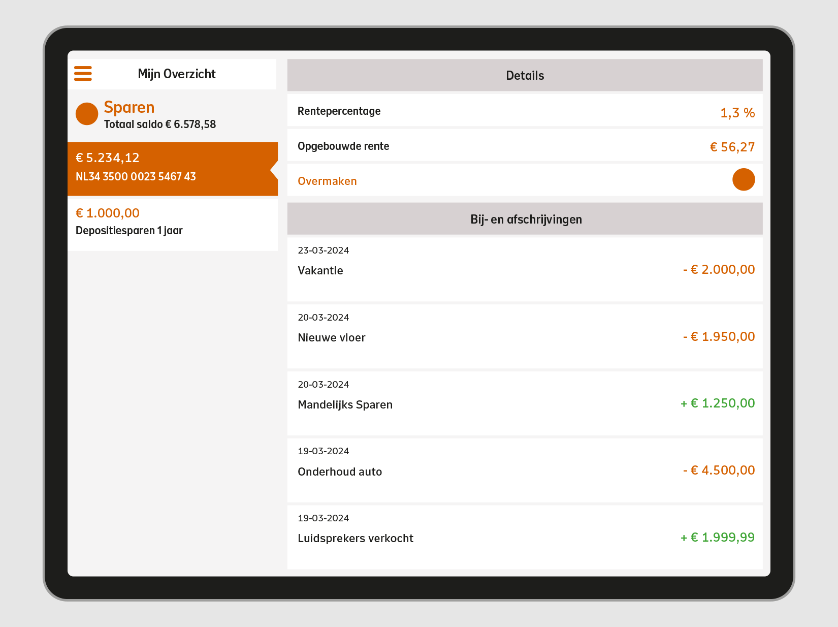
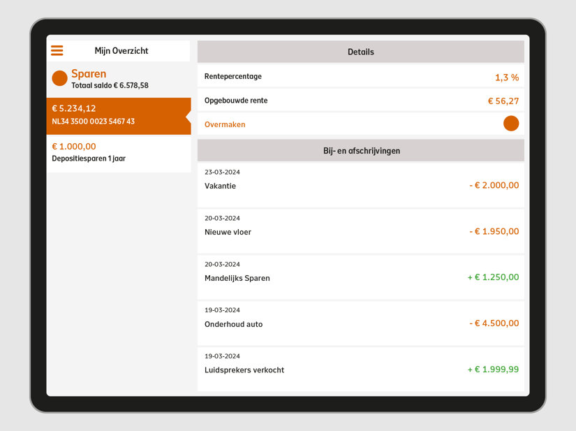
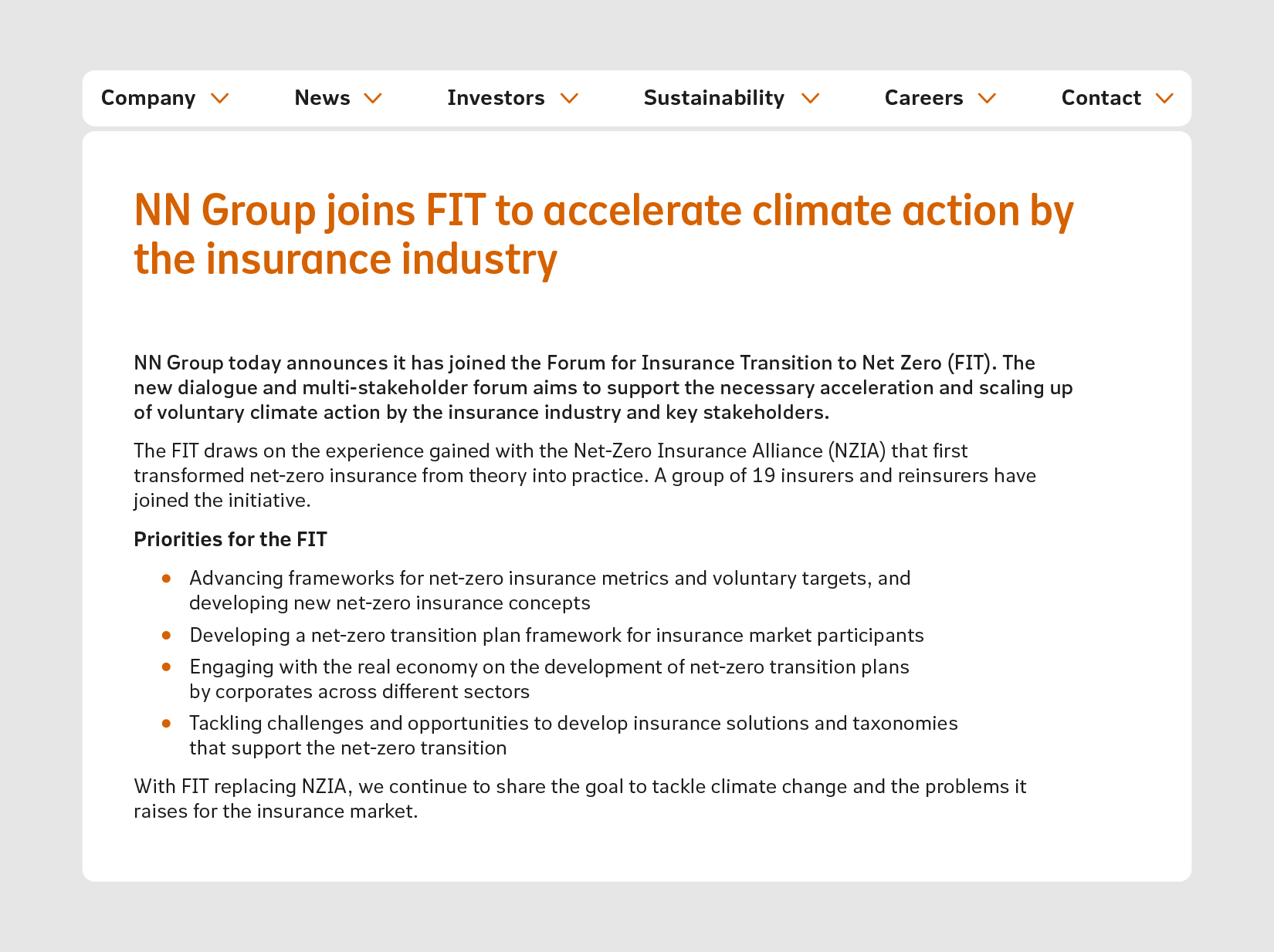
NN Nitti Grotesk was designed with a screen-first approach, incorporating distinctive details that remain recognizable even at larger print sizes. The soft forms and rounded terminals contribute to an overall warm and approachable feel. Relatively generous proportions and spacing of the Text styles guarantee excellent readability at small font sizes, in documents and correspondence. The compact Heading variant can be used where more impact, structure and hierarchy is needed.
2023
Client
Nationale Nederlanden, Den Haag
Art direction
Total Design, Amsterdam