

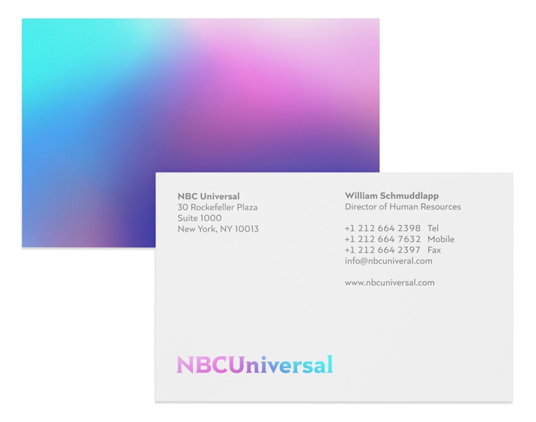
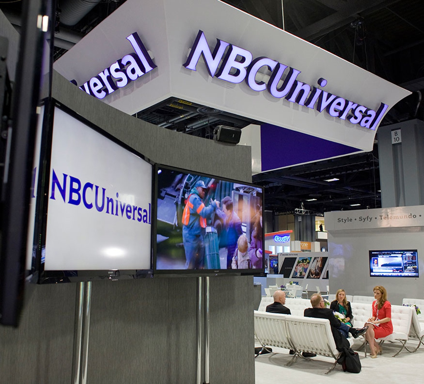

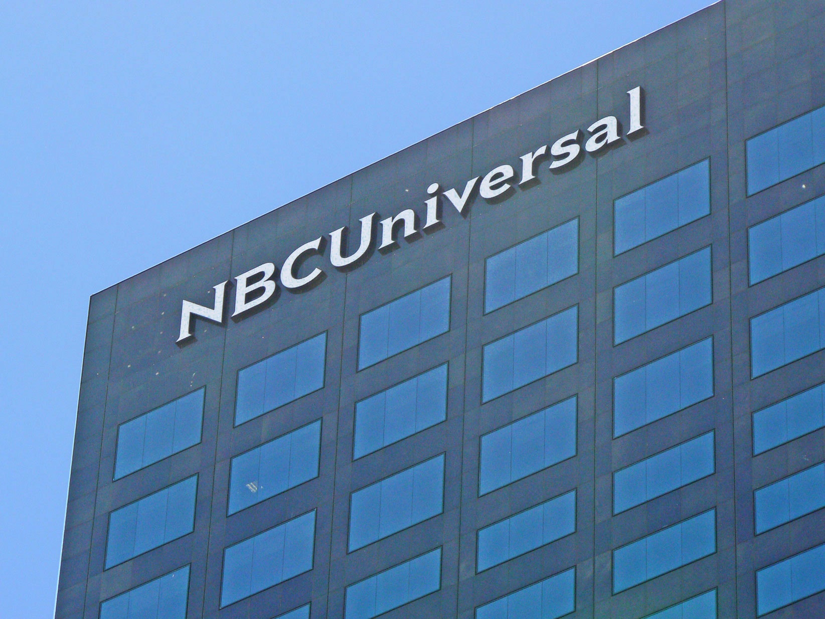

The new corporate typefaces for NBCUniversal were designed in conjunction with Mike Abbink at Wolff Olins. The series is made up of two distinct families — Rock Serif and Rock Sans (short for Rockefeller Plaza, the headquarters of NBCUniversal) — bringing together the typographic history of the two formerly separate companies NBC and Universal.
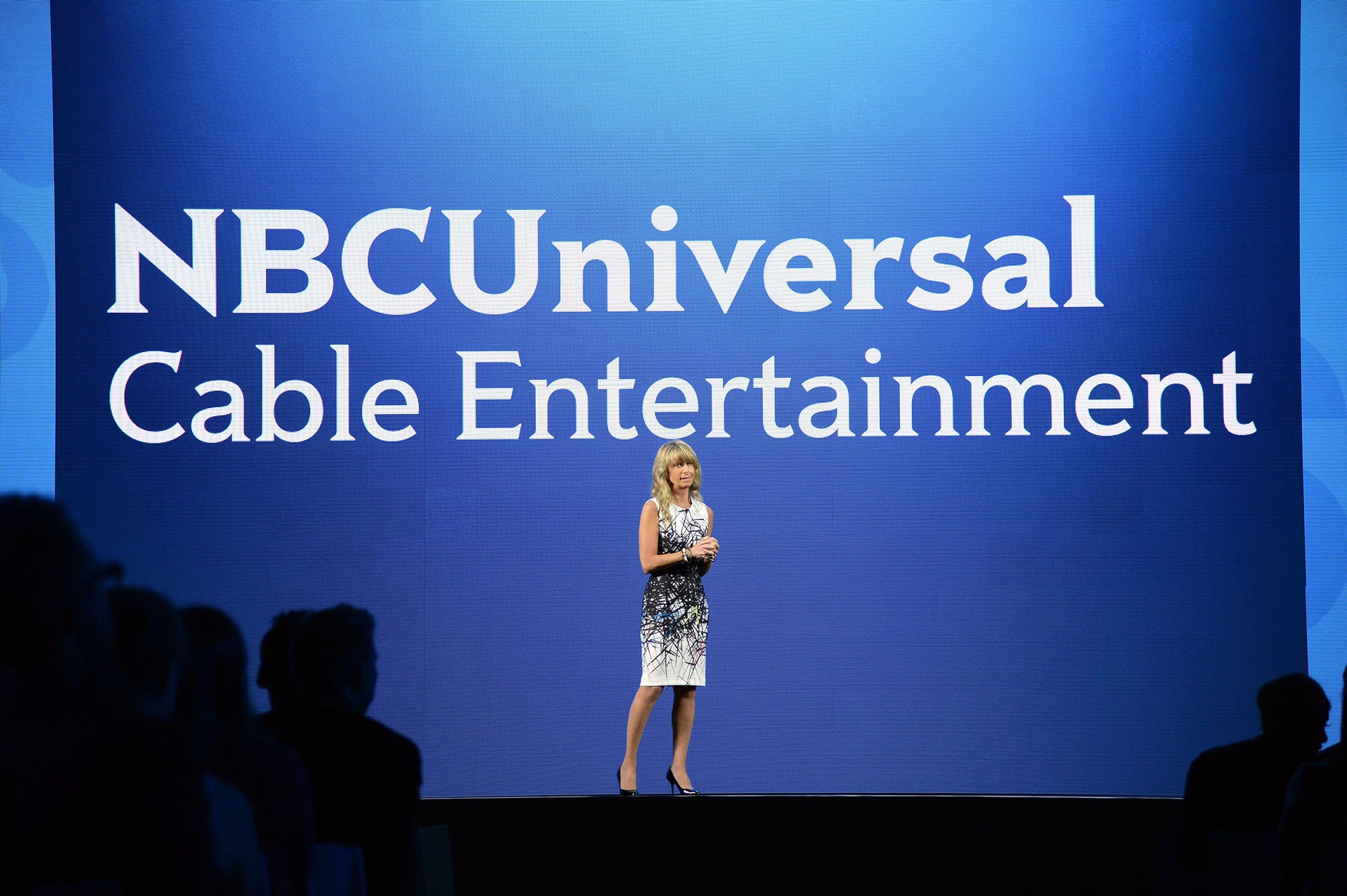
While Rock Sans comes in as a versatile sans-serif with open letterforms and good legibility in longer texts, Rock Serif is more expressive and designed for display use. With its triangular serifs and pointy apices, it is a modern interpretation of the rare Latin typeface genre (also used for the NBCUniversal logo). Nevertheless, because both families share an overal structure and key features — like the curved leg in ‘R’ and ‘k’, the drop-shaped bowl of ‘a’ and its small peaked serif — they complement each other as a confident team.
2010–2011
Client
NBCUniversal, New York
Art direction
Wolff Olins, New York