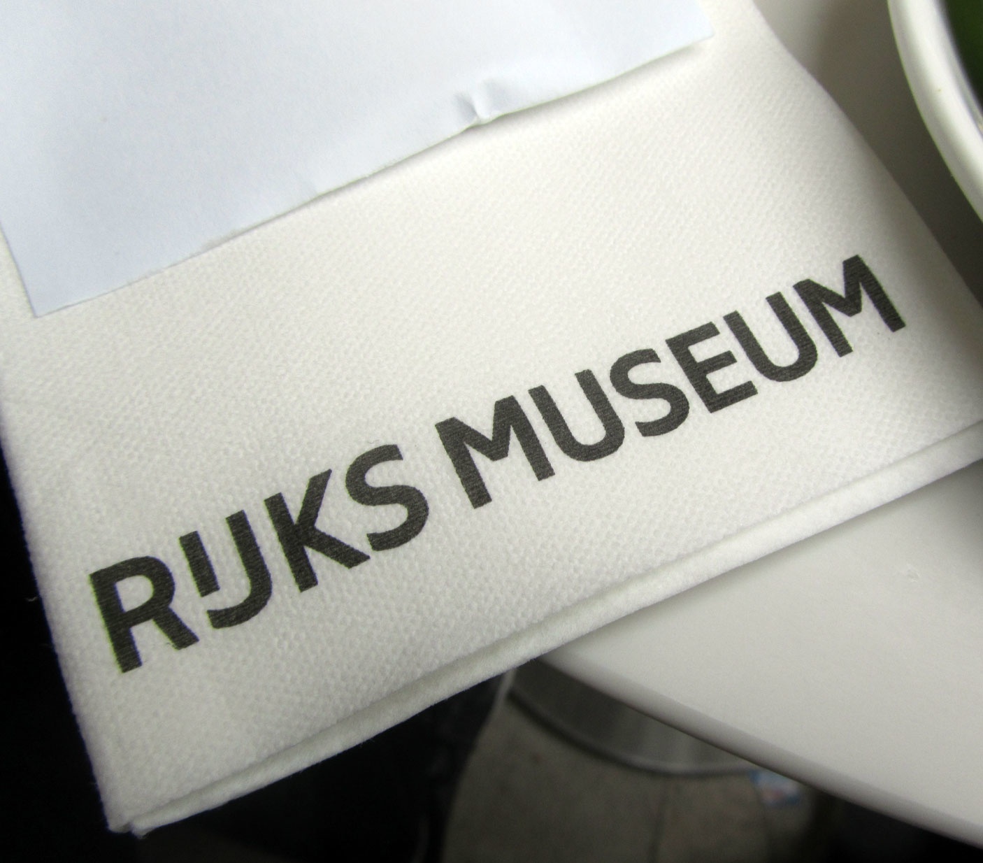
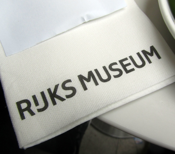
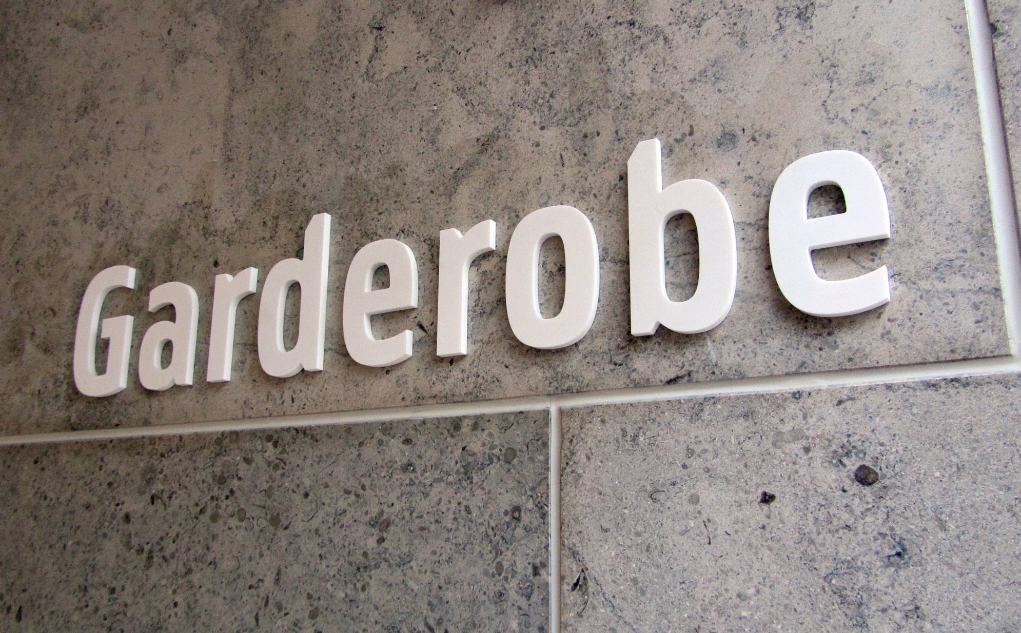
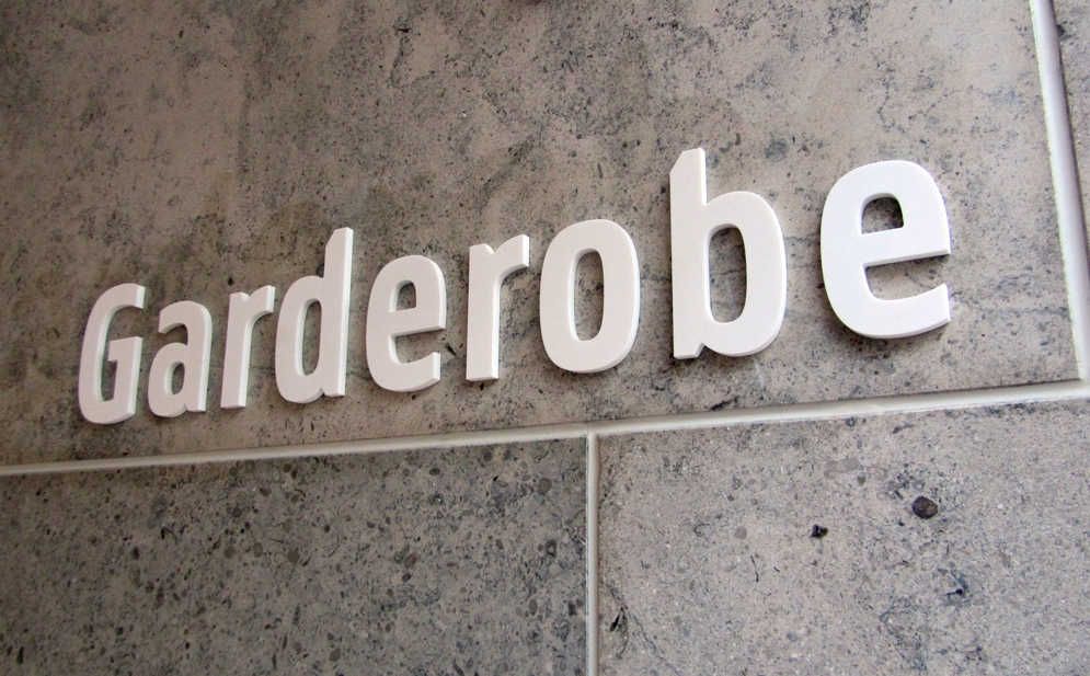
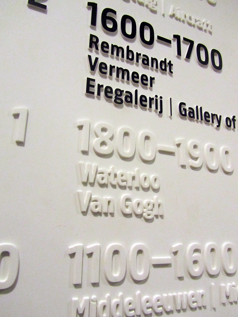
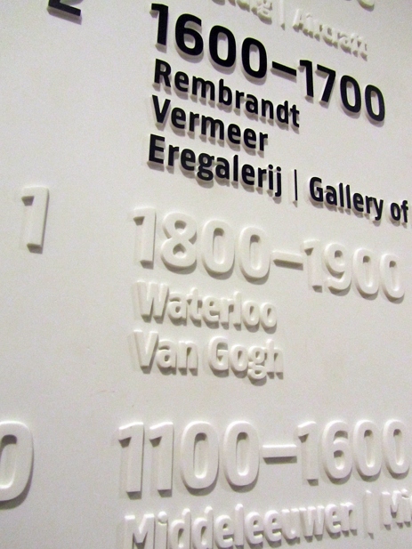

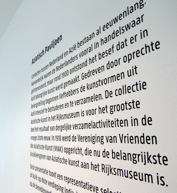

Rijksmuseum is a custom type family for the ‘museum of The Netherlands’ — the Rijksmuseum in Amsterdam. Initially, Irma Boom Office — who is responsible for the museum’s new identity — only invited us to draw the type for the logo. Eventually, we ended up designing a series of nine fonts: four for common use, four specifically for signage, and one specifically for headings. The design is based on Panno Text, but during the process it progressively developed into something more its own.
One of the unique features of the new Rijksmuseum logo is the typical Dutch form of the ‘IJ’ combination with a shortened, raised ‘I’ — an idea Irma already incorporated in her early sketches. This IJ-digraph can be found in many examples of Dutch lettering up until the second half of the 20th century, but it has since slowly disappeared. Furtunately, current font technology makes it easy to use the IJ-digraph again, and all Rijksmuseum fonts support it.
By reintroducing the use of this glyph, the Rijksmuseum strengthens its Dutch character, and at the same time, preserves a small but unique part of Dutch typographic history.
2012–2013
Client
Rijksmuseum, Amsterdam
Art direction
Irma Boom, Amsterdam