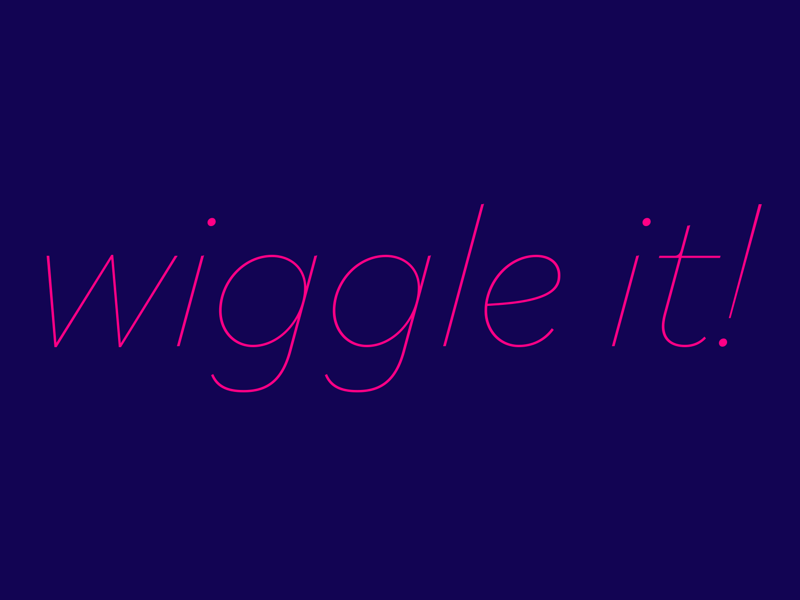
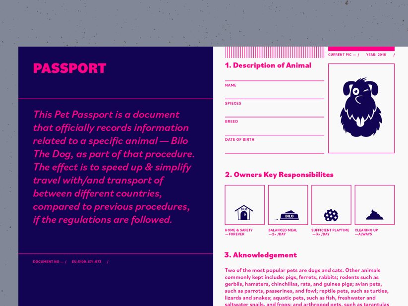
Pieter van Rosmalen’s new typeface Bilo brings along lots of flavour — and some odd-seeming curves here and there. The affable family of nine weights plus italics gives body copy an airy feel, thanks to the low x-height which also leaves ample room for accented characters. In large sizes and bold variants you may notice the unusually shaped rounds and concave terminals. Read more about what’s to discover about Bilo (and Bilo) on our Bilo family page.